HEALTH

HEALTH

HEALTH

Health Folder

Health Folder

Health Folder

Providing Navarra's population with a usable and accesible redesign for monitoring their health.

Providing Navarra's population with a usable and accesible redesign for monitoring their health.

Providing Navarra's population with a usable and accesible redesign for monitoring their health.

Project type


Category


Role


Duration


Tools

Project type


Category


Role


Duration


Tools

Project type


Category


Role


Duration


Tools

App & SaaS Web


Healthcare


Designer, Researcher


3 Weeks


Figma, Photoshop

App & SaaS Web


Healthcare


Designer, Researcher


3 Weeks


Figma, Photoshop

App & SaaS Web


Healthcare


Designer, Researcher


3 Weeks


Figma, Photoshop

Problem statement

The recent adoption of digital potential in healthcare is a step forward, but without proper research and design, the expected benefit can turn into a real struggle for many user groups.

The Goal

Help users to successfully and seamlessly complete any task they need in the digital healthcare system thanks to the new redesign of the dedicated app and the responsive website.

General research
Upcoming digital evolution

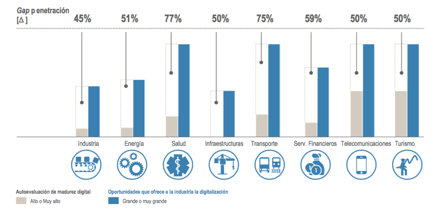
Capgemini's recent eGovernment Benchmark 2022 report highlights that more than 80% of European public services are already online, but in eHealth there is still room for improvement. The overall maturity of eHealth services in Europe is 63%.

Europe estimates that the digitalisation of healthcare will generate 120 billion benefits per year by 2030.

User Interviews
What is reallly needed?

A primary user group identified through research was elderly people who likely had to use the app on their own and needed help to do so. This user group confirmed initial assumptions about one of the Carpeta de Salud target users, but research also revealed that there were other problems in getting more users to use the app and the web, such as the messy hierarchy, the bad looking, the not so refined design or the lack of clarity in some processes.

The Original App
The current state of its design

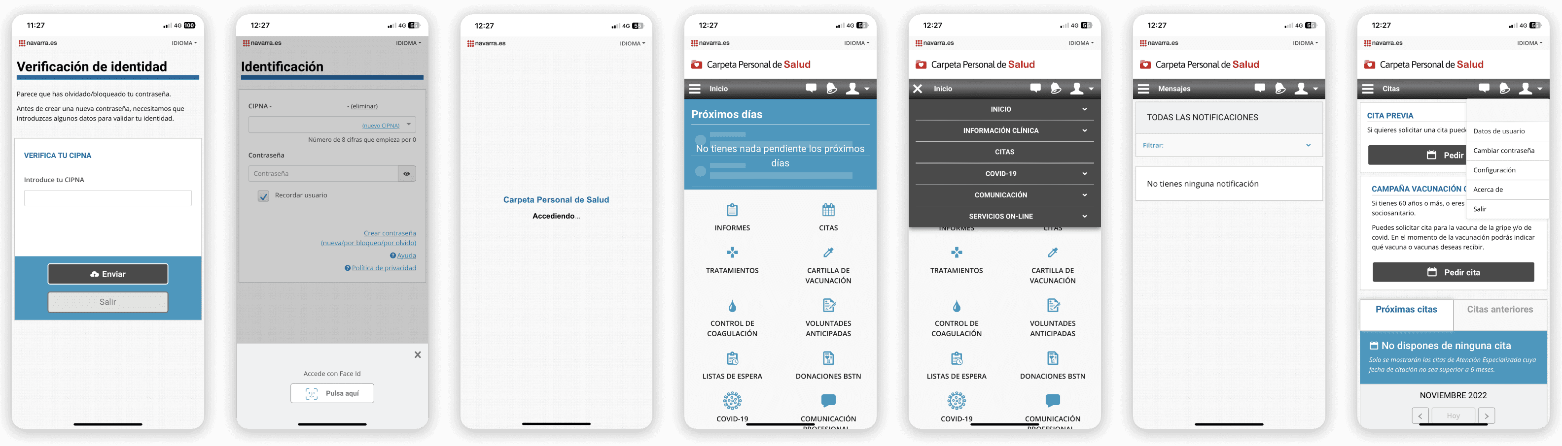
In my opinion the design for the dedicated mobile app was not a priority at the beginning, because I think their main goal was to launch the capabilities of their service to the public as soon as possible with what they had at the time.

Although they have already improved the design in some areas, it is clear to me that the first strategy was a responsive retrofit, trying to fit the content of the current desktop website into a mobile one, giving that odd look & feel of a website in a dedicated app.

Competitive analysis & References
What other healthcare systems are doing?

Although it has not been possible to check the features and functions of the direct competitors designs with an audit, there were some reference screens from other communities in Spain in the different app stores and together with other apps in the medical sector, several relevant aspects have been identified.

Sitemap analysis
Information architecture

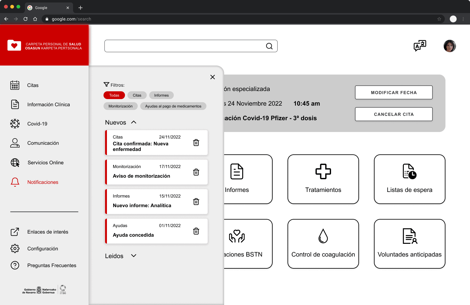
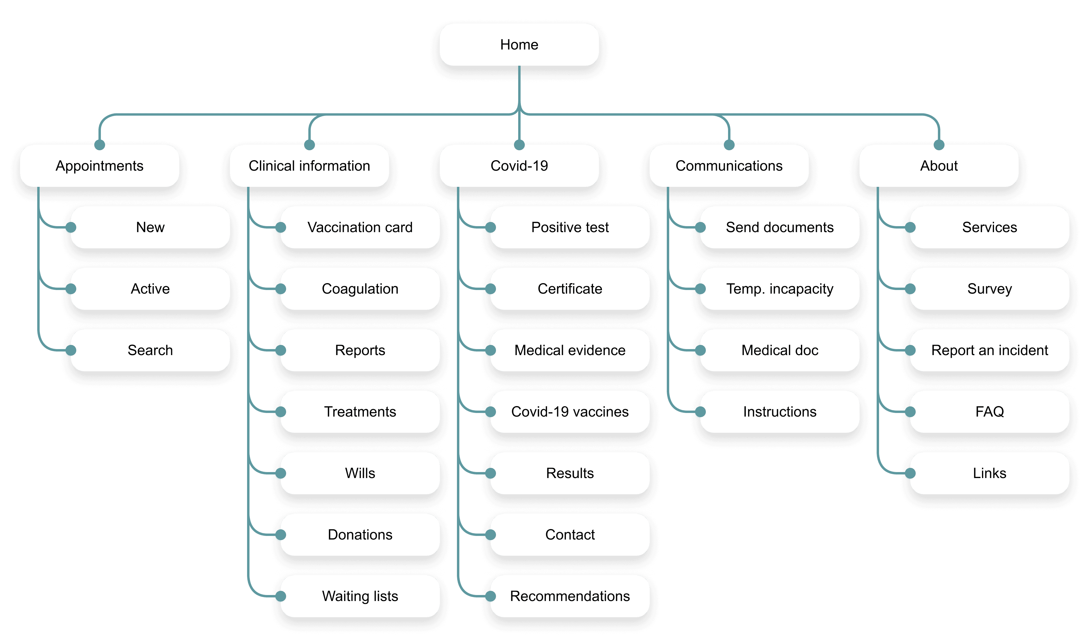
The original app has a rather messy landing page, with multiple options and duplicities. To effectively design and display all the services the app offers to users, I created a sitemap with the main themes and pages.

This way I would be able to analyse everything better, group or separate options and services if needed and help users to successfully complete their tasks with a simple but effective information architecture.

Low fidelity designs
Information architecture

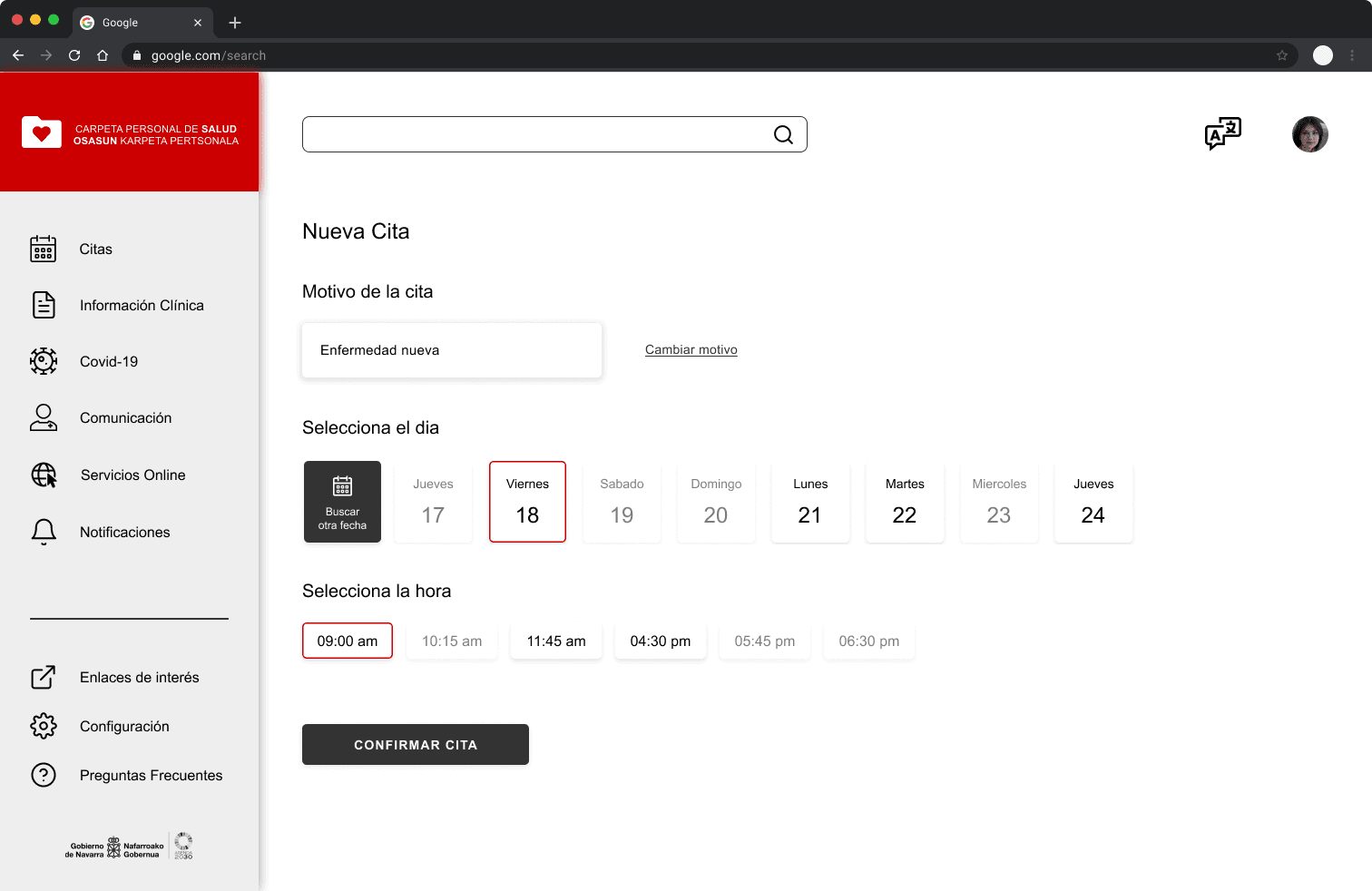
Based on those wireframes created in a modular way, I developed multiple screens and different versions of them with the goal of carrying out an early usability test to check through A/B tests which ones would be the most chosen by users.

But there was something else to take care of, the web version, and just after I completed the final designs of these screens in mobile app format, I had the idea to create them with a touch of SaaS application to discover its style and mentality through its design and try to develop my skills in different product design areas. 

Here you can see some of those screens with explanations of how specific elements address user needs.

UI Design - Style guide
Official guidelines

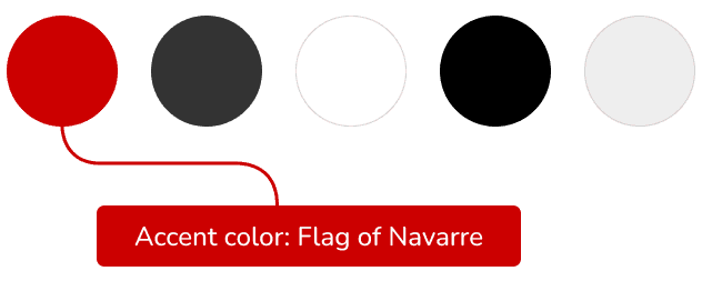
The Government of Navarra has established a style guide with the goal of standardising its public presence, not only for the physical world but also on the web, and in order to comply with it as far as possible within this project I have taken into account some of the most common ones. 

Navarra's red colour is one of the most visually appealing symbols, and together with the logos and, to a certain extent, the typography, which can also be seen to be closely related to an entity, it makes for a fairly solid style guide.

Color palette

Color palette

Font family-style
Arial, Regular & Bold

Prototype
Time to test it!

Following the mobile-first approach, I first completed the screens, animations and interactions of the smartphone application and then adapted it to larger screens, in this case to a web format. 

Below you can interact with the full Figma prototype.

Guide: Press R to restart the flow. Blue squares represent interactive areas in the design (click, drag, hover).

Due to external factors, the interactive embedded prototype is not available. Here are some screenshots of its design.

Usability testing
Do users work well with the designs?

Due to time constraints the usability test I conducted was only made over the mobile phone app prototype. However, this allowed me to do a quick check with the web version, as most of the elements were modular, so I could easily make changes if necessary.

Following a serie of prompts in which the users had to find their health reports, create a new appointment with the doctor or check their latest notifications, they provided insightful data to work with and complemented it with some final open questions and follow-ups.

Study results
Unlocking blind spots

40% of users (2 out of 5) couldn't find their way to find appointments or create new ones. They understood where to search them but they pointed out that even in the correct page they were unsure, which prevented them from understanding it successfully.

Prototype update
Prioritise and iterate

The redesign focused on assisting users with various components that already came naturally to them, such as the calendar or an information card. Some elements were also added to provide cues for the interactive flow, as well as a clear and accessible CTA button.

Accesibility check
Designing for everyone

I followed several accesibility considerations and having in mind the type of service this app is providing it would be neccesary to complement all the previous ones with the ones focused on people's health conditions.

Consistent navigation

It is kept by using same pattern and headings. This type of repetion helps people with cognitive limitations, low vision and intellectual disabilities.

Design system

Using a design system or style guide helps to have a consistency in the components which is useful to identify them on different pages with desired functionalities.

User of color

Connected with the entity public presence, preferably has to be used as a combination of color and text and/or graphics. Helpful for people with partial sight or limited color vision, color-blindness and those who use text-only, limited color or monochrome displays.

Color contrast

The most used text color and CTA buttons followed the Success Criterion for normal and large texts with the primary color as background and white for text. Passing all WCAG specifications.

Personal perspective
My take on the project

The first impression I had when I downloaded the official app of the Navarra Public Health System was truly awful. I understood the need to offer this service to the people of Navarra as soon as possible, but the design was extremely poor, which, after talking to and confirming it with several people close to me, made it worse to adapt to a digital system that many people are not used to.

My intention then was to make a simple design, easy to understand and quick to complete tasks, where all types of users could satisfy their needs without feeling overwhelmed or frustrated.

The development of the project was a little faster than I would have liked. I wish I had spent more time and attention to detail as if it were a real project, but I learned to prioritise certain design tasks while completing the Google course and even so, by reducing many of the screens/services in the prototype, I achieved my goal.