SWEETS

SWEETS

SWEETS

SweetCinemas

SweetCinemas

SweetCinemas

The easiest way to find, buy and enjoy your favorite snacks as soon as you arrive at the movie theatre.

The easiest way to find, buy and enjoy your favorite snacks as soon as you arrive at the movie theatre.

The easiest way to find, buy and enjoy your favorite snacks as soon as you arrive at the movie theatre.

Project type


Category


Role


Duration


Tools

Project type


Category


Role


Duration


Tools

Project type


Category


Role


Duration


Tools

Native Mobile App (iOS)


E-commerce, Food & Drink


Designer, Researcher


12 Weeks


Figma, Photoshop

Native Mobile App (iOS)


E-commerce, Food & Drink


Designer, Researcher


12 Weeks


Figma, Photoshop

Native Mobile App (iOS)


E-commerce, Food & Drink


Designer, Researcher


12 Weeks


Figma, Photoshop

Problem statement

The added cost to the ticket if you want to enjoy a snack or drink while you enjoy a film is one of the most frequently heard complaints about movie theaters. Not to mention the amount of time wasted to do so before even entering the screening room.

The added cost to the ticket if you want to enjoy a snack or drink while you enjoy a film is one of the most frequently heard complaints about movie theaters. Not to mention the amount of time wasted to do so before even entering the screening room.

The added cost to the ticket if you want to enjoy a snack or drink while you enjoy a film is one of the most frequently heard complaints about movie theaters. Not to mention the amount of time wasted to do so before even entering the screening room.

The Goal

Facilitate the buying and selling of snacks in movie theaters by transferring part of the process to a digital environment through a mobile application in a way that will help save time and money for both buyers and sellers and improve their overall experience.

Facilitate the buying and selling of snacks in movie theaters by transferring part of the process to a digital environment through a mobile application in a way that will help save time and money for both buyers and sellers and improve their overall experience.

Facilitate the buying and selling of snacks in movie theaters by transferring part of the process to a digital environment through a mobile application in a way that will help save time and money for both buyers and sellers and improve their overall experience.

Research
Understanding the user

One of the key elements in the design thinking process is to understand the real needs that users have, which they may or may not know, in a given scenario or product. For this, research tools and processes can provide us with information that allows us to obtain insights and, ultimately, design a better solution.

SweetCinemas is a conceptual design project and although there was some real research regarding the market and possible competition, there was no real user research. I still did simulate the processes, which allowed me to develop and learn about the whole process and the valuable implications it has on design.

Market research
How about a macro perspective?

With the global shutdown due to covid-19 and the impossibility of going to the cinema and enjoying some popcorn, cinema profits have dropped sharply. Even now in 2022, while still growing, they have not yet reached 2019 levels.

Moreover, the general economic inflation and the rising prices of the cinemas themselves are not helping cinema attendance and consumption.

Competitive analysis
What are they doing good & bad?

To reveal this, a good starting point is to conduct a competitive audit that explores competitors' strengths, weaknesses, opportunities and threats. The information gained can inform the design process and help save time, money and energy.

Some of the analysed companies, although not focused on mobile devices, have been tagged as direct competitors while others are indirect. The e-commerce and candy-related fields provide similarities in design patterns, promotion and sales formats, as well as ideas to adapt or avoid.

User research
Let's get to know them

To keep the design focused and create a user-centered product, data collection is one of the most valuable stages of the process. One of the simplest and effective ways to gather information is through primary research, it will help validating design ideas and concepts early on the design process.

The source of this information for Sweetcinemas was interviews with participants chosen from a broad demographic group. Through this qualitative research technique, users were categorized into common groups based on their situations, related to their activity, location, age and marital status:


  • People who go to watch films on a regular basis.

  • People located in urban or suburban areas nearby to movie theaters.

  • Ages between 12 to 55.

  • Parent with kids, couples and singles.

Pain points
Where does it "hurt"?

High cost

High cost

Users have reported the difference in prices between common snack shops and those located in movie theaters or owned by them.

Users have reported the difference in prices between common snack shops and those located in movie theaters or owned by them.

Variety

Variety

Some people have complained about the excessive amount of snack variety, leading them to feel lost when choosing snacks.

Some people have complained about the excessive amount of snack variety, leading them to feel lost when choosing snacks.

Loss of time

Loss of time

A common point to all users is the loss/wasting of time, either in queues or in the snack selection-purchase process.

A common point to all users is the loss/wasting of time, either in queues or in the snack selection-purchase process.

Crowds

Crowds

Many users stated that crowds can bring your mood down very quickly and said that it is not ideal for enjoying the moment.

Many users stated that crowds can bring your mood down very quickly and said that it is not ideal for enjoying the moment.

Flow diagrams
Where do decisions lead?

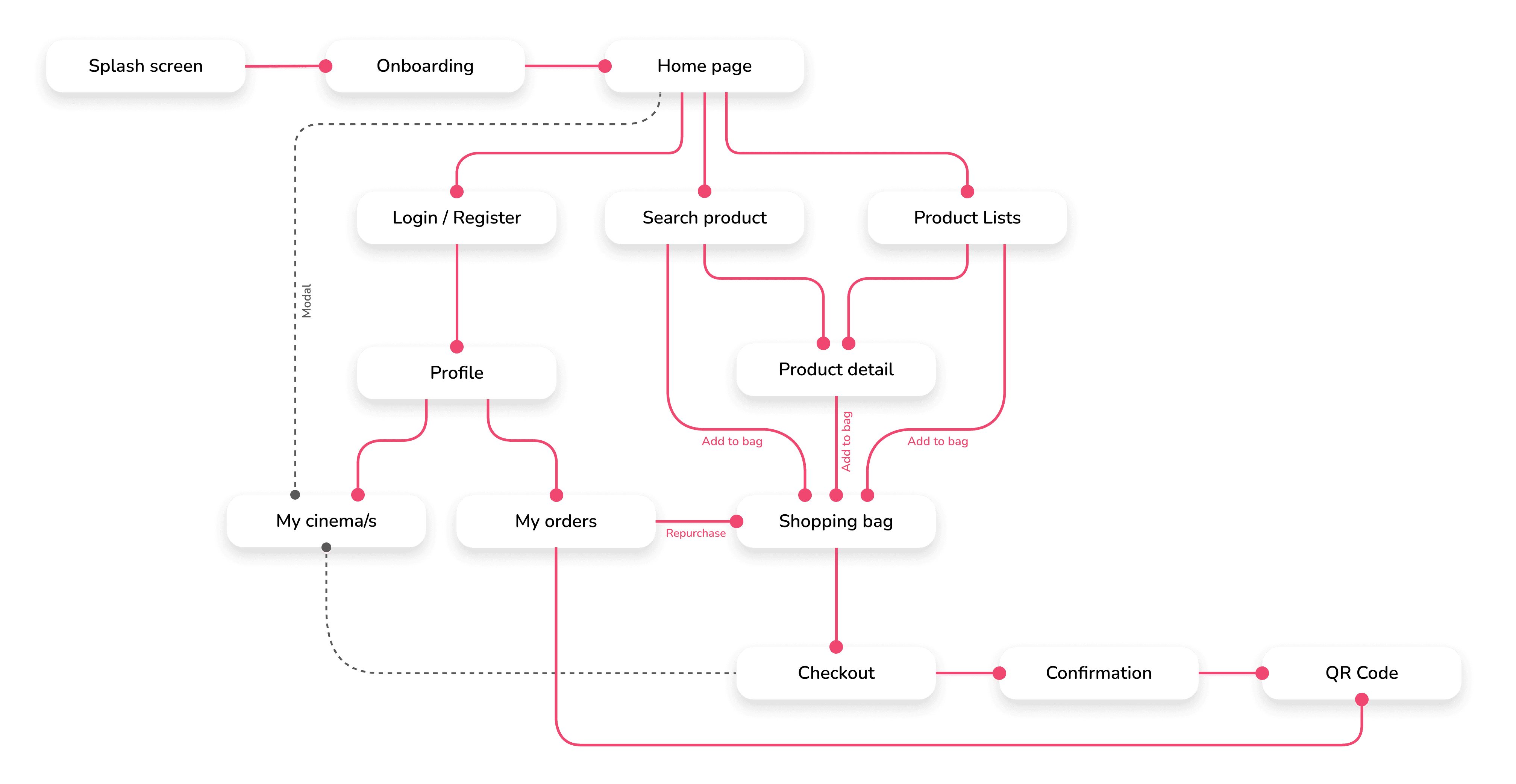
After listing many of the main screens and processes that SweetCinemas needs to provide its service, it was time to connect the dots and create the flows that outline all the different paths the users can take. They must be a living document, ready to support for possible corrections and necessary updates as the design progresses and testing is carried out.

These diagrams can represent a general view or go deep down to the smallest details, helping depicting complex systems or workflows. Here is the flow diagram of the main processes of the application:

Wireframes
First ideas and blueprints

The main goal at this stage was to quickly draw multiple design versions where I could find out concepts, elements and screens that I would like to have or avoid in the final app design.

And then I draw a more accurate and refined version of those screens I found suitable for the app and that I would digitalize into wireframes.


  1. Splash Screen

  2. Onboarding Screen

  3. Home Screen

  4. Overlay GPS Location-Cinema Screen

  5. Products Grid Screen

  6. Products List Screen

  7. Cart Screen

  8. Checkout Screen

  9. Product Card Screen

  10. Search Bar Overlay

  11. Settings

  12. Click & Collect QR Code Screen


Low Fidelity
Let's get to know them

With everything on mind, the flow diagram, the generated ideas with the sketches, the wireframes, first iterations of low-fidelity prototype and an early usability study, a proper base prototype to take into the next steps.


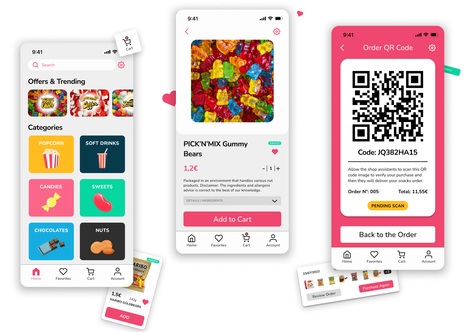
Here you can see some of those screens with explanations of how specific elements address user needs.

High Fidelity
Up to 44 screen designs

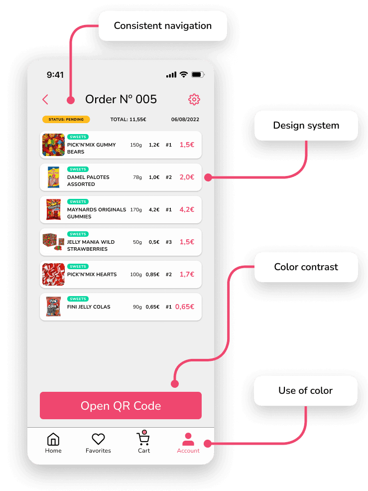
Candy pink was the go-to accent color to start this design style guide, giving the proper mood of sweetness. The font family was another important factor to imprint character on the service, and Nunito is such a good modern match delivering information in a sweet and soft manner.

The screen creation process continued generating new ideas through the iterative cycles of the design process, including different product lists views and product details patterns that could be used for A/B testing in further design stages.
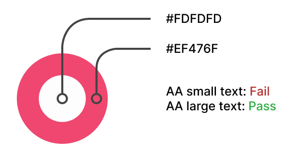
Color palette

Accent, primary, secondary,
tertiary, background

Accent, primary, secondary,
tertiary, background

Accent, primary, secondary,
tertiary, background

Font family & styles

Nunito

Regular, Medium, Semibold, Bold

Nunito

Regular, Medium, Semibold, Bold

Nunito

Regular, Medium, Semibold, Bold

Prototype
Time to test it!

With many of the high fidelity designs finished, I began connecting them, allowing the interaction with many of the features and thus creating a clickable prototype.

Below you can interact with the full Figma prototype.Guide: Press R to restart the flow. Blue squares represent interactive areas in the design (click, drag, hover).

Usability
Feedback incoming

I decided to conduct a last usability study with 5 users to validate the prototype before wrapping it up. I wanted to be sure users understand the features and the processes available in it and see if there are any additional neccesities.


3 of them on site and 2 online, followed a serie of prompts in which they had to complete specific tasks like using the search bar, completing an order, reviewing past orders or checking the details of a product. After this, I continued with a serie of questions to complete the study.

Study results
Unlocking blind spots

60% of users (3 out of 5) were unsure and felt lost during the review past order task. They understood where to search past orders but they pointed out that "My orders" page was cluttered with many options, colours and buttons, which prevented them from understanding it successfully and therefore making the task success rate fall to just 40%.

Prototype update
Prioritise and iterate

I then redesigned the "Order Card" component and its elements from what users were commenting about the previous one. I couldn't further validate it again with another usability study but I just kept the terciary color for pending orders so that users can easily find it and reordered the options and the main CTA position. 

Accesibility Check
Be mindful of diversity

From the level of knowledge I had at the start of this project, I took into account several considerations to make the design as accessible as possible throughout the process.

Consistent navigation

It is kept by using same pattern and headings. This type of repetion helps people with cognitive limitations, low vision and intellectual disabilities.

Design system

Using a design system or style guide helps to have a consistency in the components which is useful to identify them on different pages with desired functionalities.

Use of color

The use of color is connected with the intended mood, but preferably has to be used as a combination of color and text and/or graphics. Helpful for people with partial sight or limited color vision, color-blindness and those who use

text-only, limited color or monochrome displays.

Color contrast

Following the Success Criterion for large texts (18 point text or 14 point bold text) I designed the CTA buttons with the accent color as background and a shade of white for text. All button sizes comply and pass the WCAG AA for this specification.

Summary
My take on the project

As the first complete UX Design project, from concept to delivery, I am so proud of SweetCinemas because what it means to me. Even with all the improvements I can do now after practicing and learning more in other projects, it has been the start of a new chapter for me.

Thanks to Google's UX Design certificate in Coursera, I was able to learn and follow each step of the design process, allowing me to integrate theory and practice along the way and although it took several weeks to finish, it was well worth it.

Throughout the whole journey, I have checked several other resources, learnt from articles and youtubers, helped my peers with their designs, kept trying out different concepts and ideas on my own designs, updating elements or discharging them in order to improve the users sxperience in the mobile app while simultaneously maintaining the business goals of the case study.